Custom Dashboard
Designed the flagship feature behind the launch of TIKR Ultimate — a premium subscription tier priced 40% higher than our previous top plan.
The cornerstone feature that justified the new tier and converted power users into higher-paying subscribers.
Role: Product Designer — sole designer, UX architecture + execution
Team: CEO, Engineering, Marketing
Timeline: ~3 months
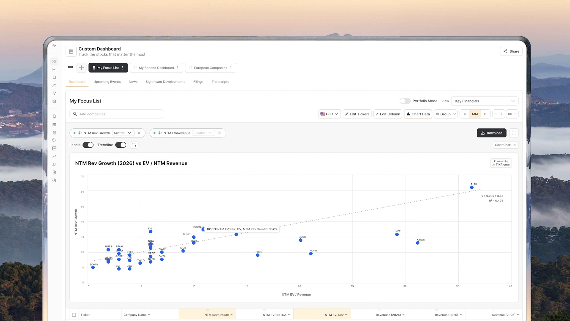
Business Objective
Our company wanted to increase Average Revenue Per User (ARPU) by introducing a higher priced subscription tier. To justify the price increase, the new tier needed a high-value feature that serious investors would be willing to pay for.
The strategy we agreed on:
- Launch a premium tier priced 40% higher
- Provide exclusive advanced tools
- Convert existing power users into higher tier subscribers
Custom Dashboard became the core feature that supported this launch.
The goal was to create a powerful research workspace where investors could monitor hundreds of companies and financial metrics in a single view — something serious investors were repeatedly requesting but our platform didn't yet support.
The feature allows users to:
- Track 300+ financial metrics (including 50 newly introduced metrics)
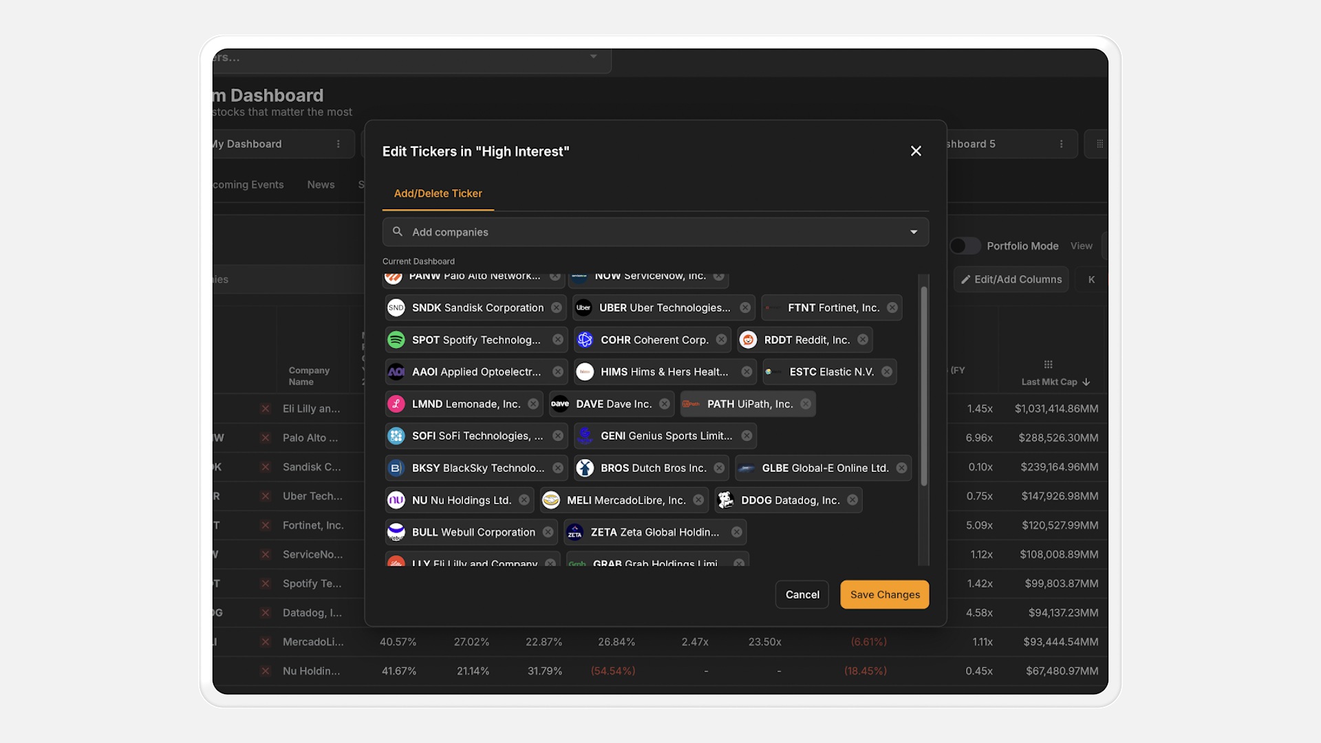
- Monitor up to 500 companies per dashboard
- Create multiple dashboards for different investing strategies
- Follow news, filings, earnings transcripts, and developments alongside financial data
My Contribution
I led the product design for the Custom Dashboard feature, including:
- UX architecture
- Table and large dataset design
- Dashboard customization workflows
- Component design within our legacy UI system
- Collaboration with engineering on technical constraints
- Coordinating with marketing and leadership for launch readiness
User Problem
The old 'My Watchlist' couldn't keep up with how investors actually work.
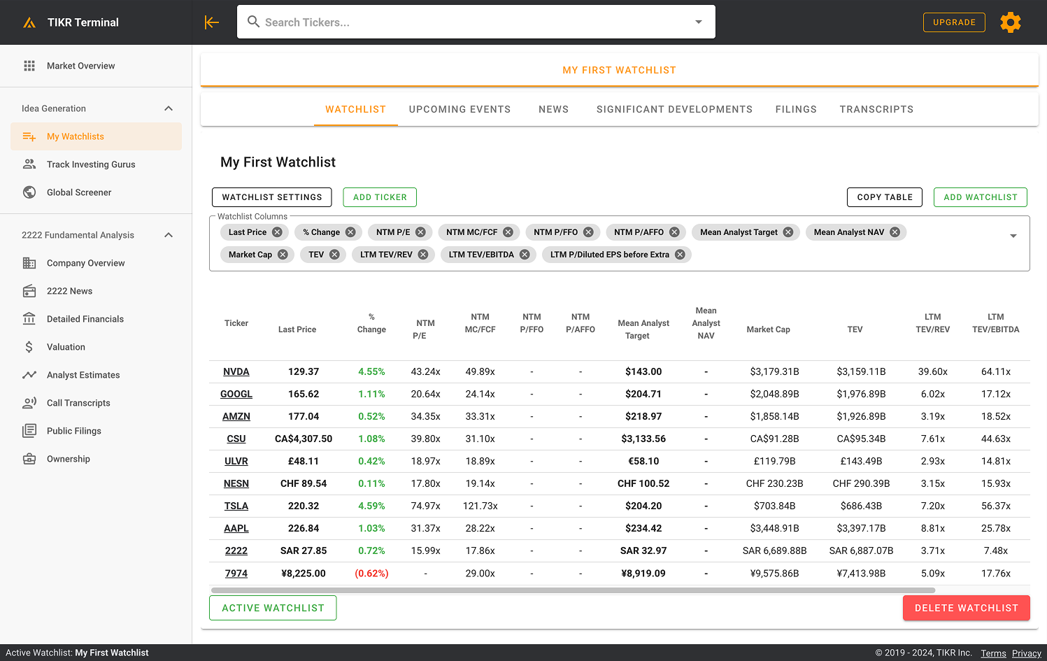
Limited to 25 metrics
Users wanted to explore hundreds of key metrics.
No control over data display
So it couldn't show future estimates past a year.
No way to rearrange or organize
Watchlists were static and hard to customize.
Research & Insights
Some User Quotes:
Users could not:
- Track many financial metrics at once
- Customize how data was displayed
- Monitor companies across different timeframes and financial perspectives
They wanted a single place where they could:
- Track all companies they care about
- Monitor key metrics
- Quickly spot changes in performance
As an active investor myself, I also experienced this gap firsthand and often relied on competitor tools to fill this need.
Competitor Analysis
We analyzed platforms including:
- Bloomberg
- Koyfin
- Finviz
- Seeking Alpha
Most competitors offered watchlists, but they typically had limited metric customization. This revealed an opportunity to differentiate by allowing much deeper control over financial data.
Key Design Challenges
Designing for large datasets
Dashboards needed to support:
- 300+ metrics
- 1000+ companies
- Multiple dashboards per user
This created challenges in:
- Table readability
- Column organization
- Performance
- Information density
Design decisions included:
- Compact table layouts
- Column grouping
- Customizable metric selection
- Saved dashboard views
Financial Considerations (technical jargon)
Solution
A powerful, fully customizable research workspace.
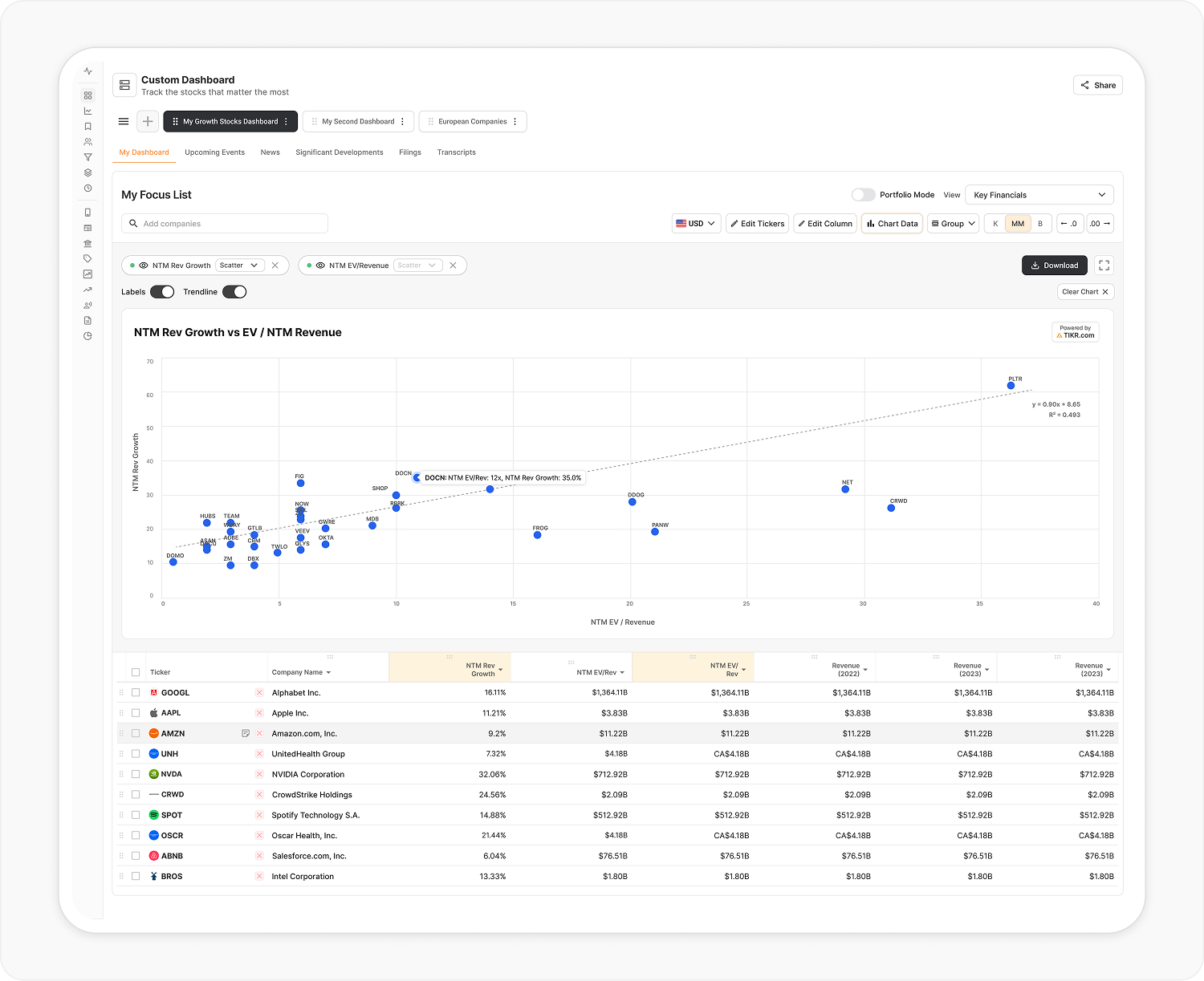
Allow users to create scatterplot, line and bar charts to create data visualizations of their company metrics.
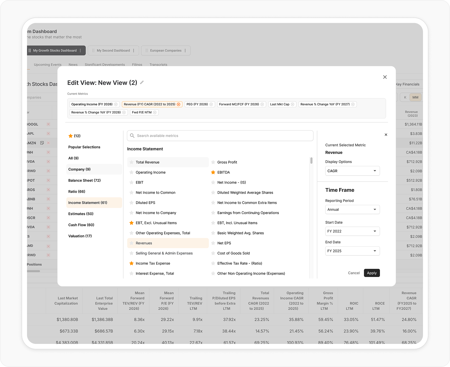
A menu with all the potential metrics a user could track.
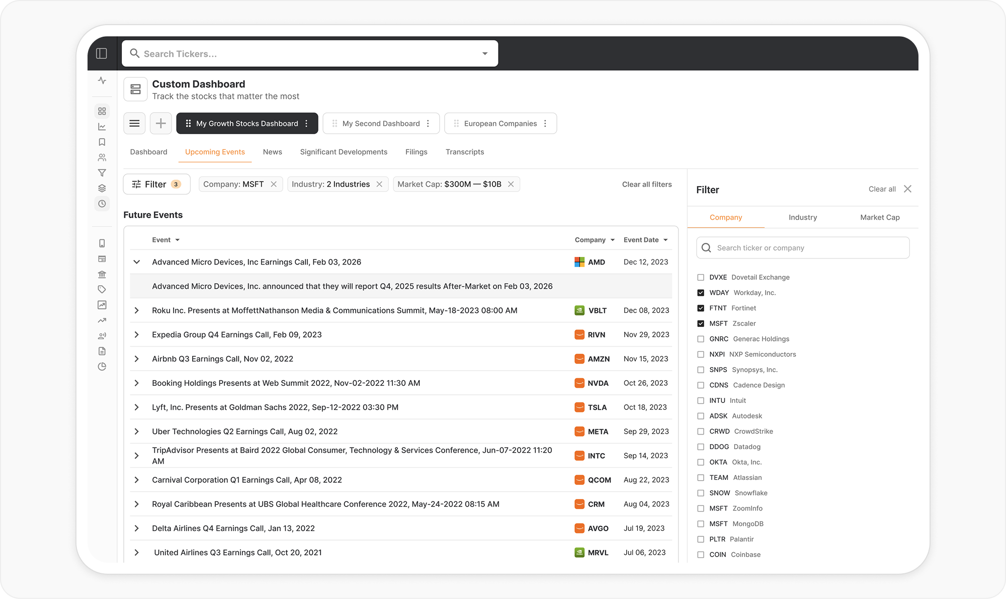
Sub-tabs for each dashboard let users view and filter upcoming events for their dashboards, to stay on top of timely events.
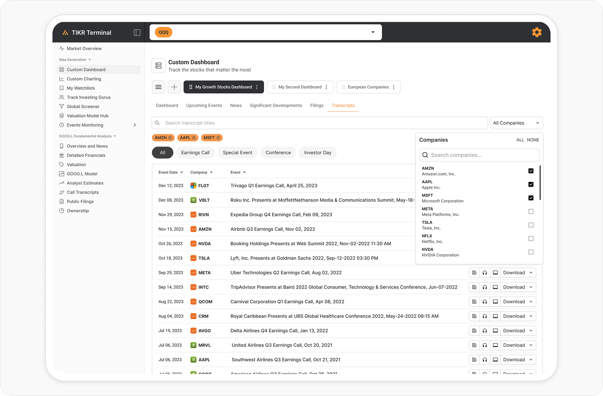
Transcripts, event calls, audio and slides accessible at the click of a mouse or tap of a finger.
Results & Key Learnings
The launch of this feature is a new focal point of the app that will anchor the majority of our marketing and sales efforts moving forward, with still yet a number of expands to come — detailed portfolio analysis with visuals, AI assistance and recommendations, custom metric creation and more.
I learned a lot about how to create data-heavy designs, and about working intimately with the development team to figure out quick, effective solutions to meet our deadlines.